¶ BlueCollar Projects Dashboard
The Projects Dashboard gives a real-time financial picture of a project — at-a-glance KPI tiles, two detailed financial tables, and revenue, cost, and gross-profit trend charts — all filtered by project and date range. This is valuable because the numbers a project manager checks most often (contract value, earned revenue, margin, percent complete, and how billings track against costs) are gathered into one screen instead of being pulled from separate reports. For the broader reporting picture, see Reporting and KPIs.
¶ Filters
The dashboard is scoped to one project at a time:
- Project — search and choose the project to view.
- Date Range — pick a preset (Last 7 days, Last 30 days, This quarter, Last year, or This year), or set explicit Start Date and End Date values, then Apply Filter. The dashboard opens on a recent date window so you see current activity right away.
¶ Personalizing the Dashboard
The dashboard is a configurable layout of cards, and you can tailor it to the numbers you check most.
The primary control is the Personalize button in the top bar, which opens a drawer where you can:
- Show or hide any card by clicking it.
- Reorder cards by dragging them.
- Click Default at any time to return to the standard layout.
Your choices are remembered in your browser, so the dashboard comes back the way you left it the next time you open it.
You can also adjust cards directly on the dashboard. Each card has a Hide control (the eye-slash icon) to tuck it away — restore it later from the Personalize drawer — and you can drag a card to reorder it. Charts add a Fullscreen control (the expand icon) for a closer look at the trend.
The four headline numbers are managed as a single KPI card — they show or hide together rather than one at a time. Depending on your role, some cards may not appear; your administrator can grant access to individual cards.
¶ KPI Tiles
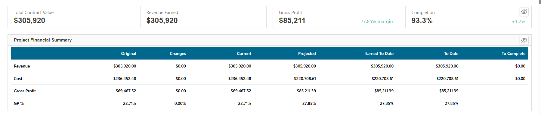
Four headline metrics run across the top:
- Total Contract Value — the project's current contract value.
- Revenue Earned — recognized (earned) revenue to date.
- Gross Profit — earned gross profit, with the margin % shown beside it.
- Completion — percent complete, with the change since the prior period.
¶ Project Financial Summary
Shown in the screenshot above, this table breaks Revenue, Cost, Gross Profit, and GP % across the project's financial lifecycle:
| Column | Meaning |
|---|---|
| Original | The original contract/estimate value |
| Changes | Net impact of approved change orders |
| Current | Original + Changes |
| Projected | The current forecast at completion |
| Earned To Date | Recognized to date (per percent-of-cost-complete) |
| To Date | Actuals booked to date |
| To Complete | Remaining (Current − To Date) |
Positive and negative figures in the Changes and To Complete columns are color-coded (green / red).
¶ Project Metrics
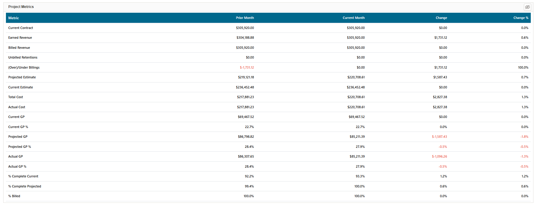
A month-over-month view with columns Metric, Prior Month, Current Month, Change, and Change %. Tracked metrics include: Current Contract, Earned Revenue, Billed Revenue, Unbilled Retentions, (Over)/Under Billings, Projected Estimate, Current Estimate, Total Cost, Actual Cost, Current GP, Current GP %, Projected GP, Projected GP %, Actual GP, Actual GP %, % Complete (Current), % Complete (Projected), and % Billed. Increases show in green and decreases in red, so month-to-month movement (e.g., a dip in projected margin) stands out.
¶ Trend Charts
The trend charts plot over the selected date range. The cumulative charts show running totals; the monthly charts show period-by-period bars of the same measures.
¶ Cumulative Revenue
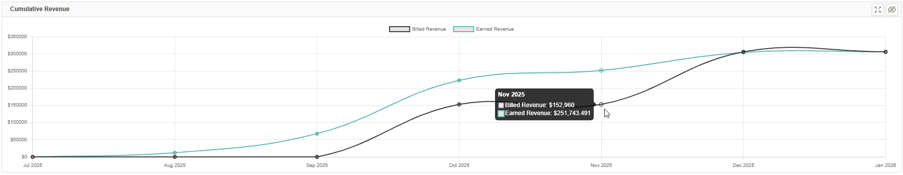
Billed Revenue versus Earned Revenue over time. The gap between the two lines is the project's over/under-billed position — earned above billed means underbilled, billed above earned means overbilled (see Revenue Recognition).
¶ Cumulative Cost
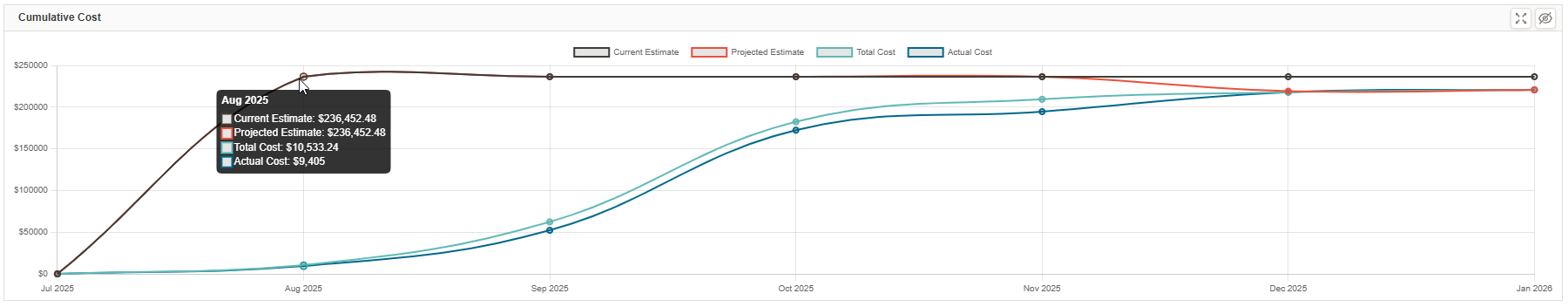
Current Estimate, Projected Estimate, Total Cost, and Actual Cost over time — useful for watching actual and committed cost climb toward (or past) the estimate as the job progresses.
¶ Cumulative Gross Profit
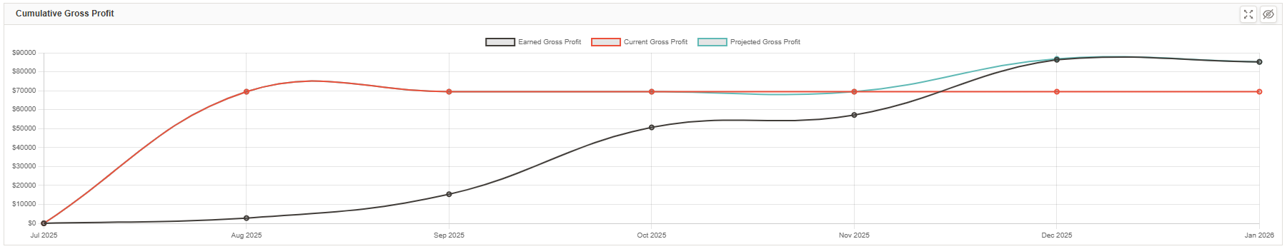
Earned Gross Profit, Current Gross Profit, and Projected Gross Profit over time, so you can see whether the margin you're earning is tracking with the current and projected outlook.
¶ Monthly Revenue, Cost, and Gross Profit
Beneath the cumulative charts, the same measures appear as monthly bar charts for period-by-period comparison rather than running totals:
- Monthly Revenue — Billed vs Earned Revenue per month.
- Monthly Cost — Current Estimate, Projected Estimate, Total Cost, and Actual Cost per month.
- Monthly Gross Profit — Earned, Current, and Projected GP per month.